![logo-grande.jpg]](https://ayuda.pxsol.com/hs-fs/hubfs/logo-grande.jpg?height=40&name=logo-grande.jpg)
Nombre: Bloque - Beneficios Home
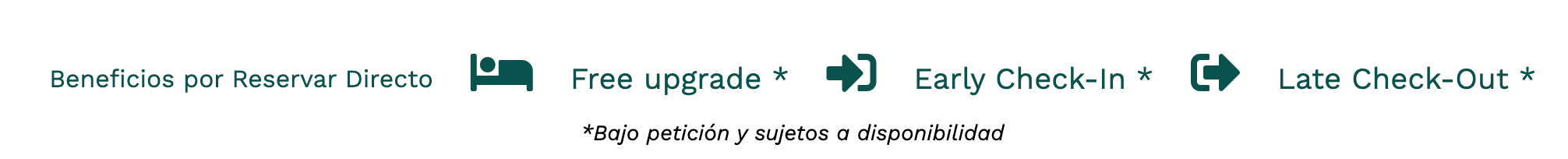
Estructura: Iconos con texto
Apariencia:
CSS:
//Escritorio
.services-list {
padding-bottom: 1rem;
margin-bottom: 3rem;
margin-top: 40px;
border-bottom: 1px solid $primaryColorDark;
.condiciones{
width: 100%;
text-align: center;
font-size: 14px;
font-style: italic;
}
&.no-first {
ul {
li {
&:first-of-type {
h5 {
padding-left: 0.5rem;
font-size: 1.2rem;
}
}
}
}
}
&.no-border {
border-bottom: none;
}
ul {
display: flex;
justify-content: column;
flex-wrap: wrap;
li {
padding: 0.5rem;
align-items: center;
display: flex;
justify-content: left;
h5 {
font-size: 1.2rem;
color: $primary-color;
padding-left: 0.5rem;
}
h6 {
font-size: 0.8rem;
color: $primary-color;
padding-left: 0.5rem;
}
span {
display: inline-block;
color: $primary-color;
width: auto;
float: left;
height: 40px;
font-size: 2rem;
padding: 0 0.5rem;
padding-right: 1rem;
}
&:first-of-type {
h5 {
padding-left: 0;
font-size: 1rem;
}
}
}
}
@media (max-width: 768px) {
padding-bottom: 0;
border-bottom: none;
margin-bottom: 2rem;
ul {
flex-direction: column;
li {
width: 60%;
margin: 0 auto;
&:first-child {
text-align: center;
}
&.no-text {
text-align: left;
}
}
}
}
}
.mobile .services-list {
display: block;
ul {
width: 100%;
display: unset;
li.no-text {
float: left;
width: calc(33% - 15px) !important;
flex-wrap: wrap;
text-align: center;
span {
font-size: 25px;
height: auto;
width: 100%;
}
h5{
font-size: 13px;
margin: 10px 0px;
}
}
}
}